Outreach Dashboards
Reimagining the engagement tracking dashboards to serve a growing set of personas and use cases.
- Team
- 1 Lead Designer, 1 Design ManagerCollaboration with PMs and engineers
- Company & Role
- Product Designer
- Timeline
- Nov '22 – Jan '23
In USA, a patient's data exists in an intelligent system of interconnected online portals.
Innovaccer builds the data and AI infrastructure that helps health systems (on any scale) unify that patient data and drive workflows to maintain the health, risks and satisfaction of their patient population.
I joined as a Product Designer under the ‘Experience’ vertical, Innovaccer's Patient Relationship Management module, working primarily on its campaign management tool, Outreach.
I supported and worked with a team of 1 Lead Designer and 1 Design Manager, collaborating regularly with other stakeholders (Product Managers, Engineering Managers and Engineers).
In Outreach, I worked to expand the product's use cases and features, catering to both customer requests and product vision.
This case study covers one of the first big projects I was handed: to completely re-imagine the dashboards for campaign management. It was exciting, and it let me test my design thinking in a real world application.
The dashboards had not been updated in a long time. Three things made the case for updating them.
- 01
Text and calls sit on an outdated PowerBI
The only dashboard we have for text and calls is a very basic PowerBI one, outdated both in how it functions and in the metrics it carries.
- 02
No PowerBI at all for Email and Letters
Both channels are read off a native dashboard the Outreach team built, which does not convey enough and holds no long term trend.
- 03
Pitched dashboards get tweaked
The standard dashboards pitched to customers are tweaked to cater to each of them, which means items are missing from what we pitch in the first place.
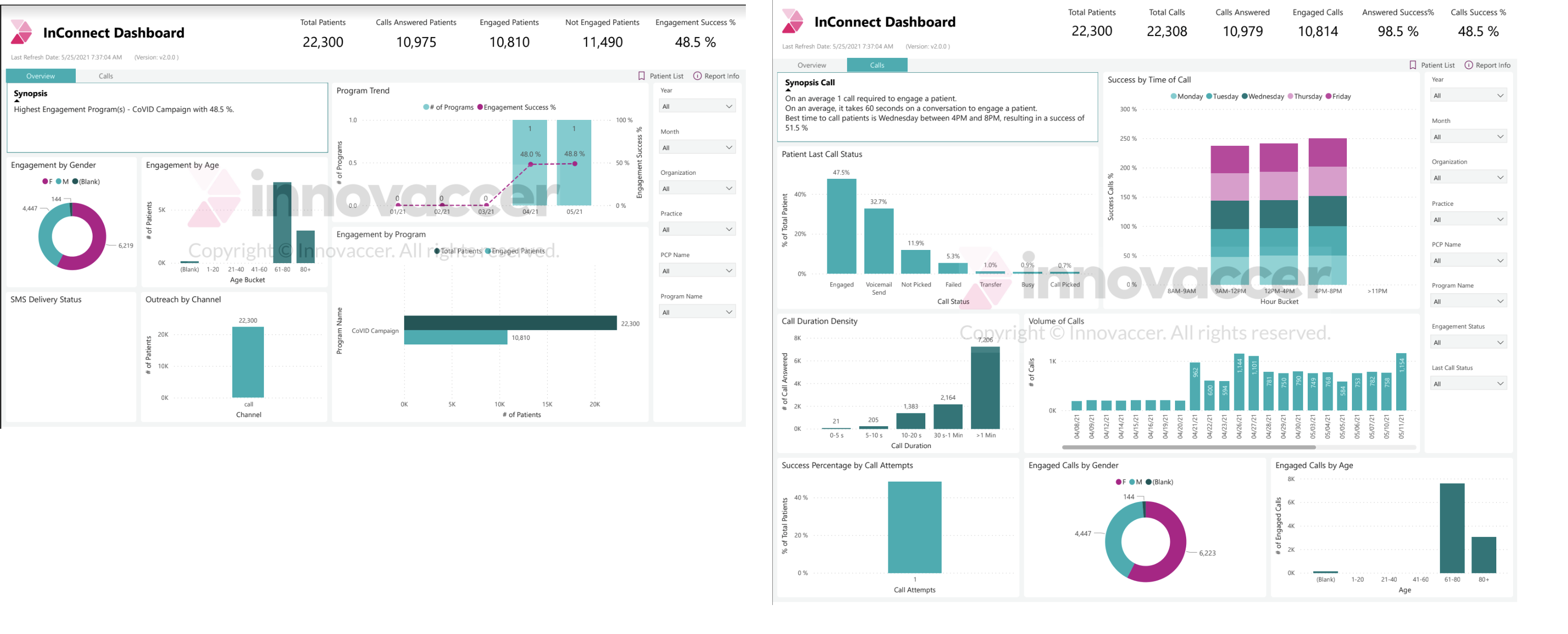
Questioning the PRD, and diving deeper into the complete ecosystem, highlighted a problem that was never explicitly mentioned.
It was not only the dashboards that were outdated. The idea of who the dashboard was for, and what use they would make of it, was outdated too.
Restyling the dashboard would have made the existing problems harder to see.
We had to go back to the persona, the journey, and the questions.
Going back to the persona, the journey and the questions meant answering three things before anything could be drawn.
- 01Who is the user?
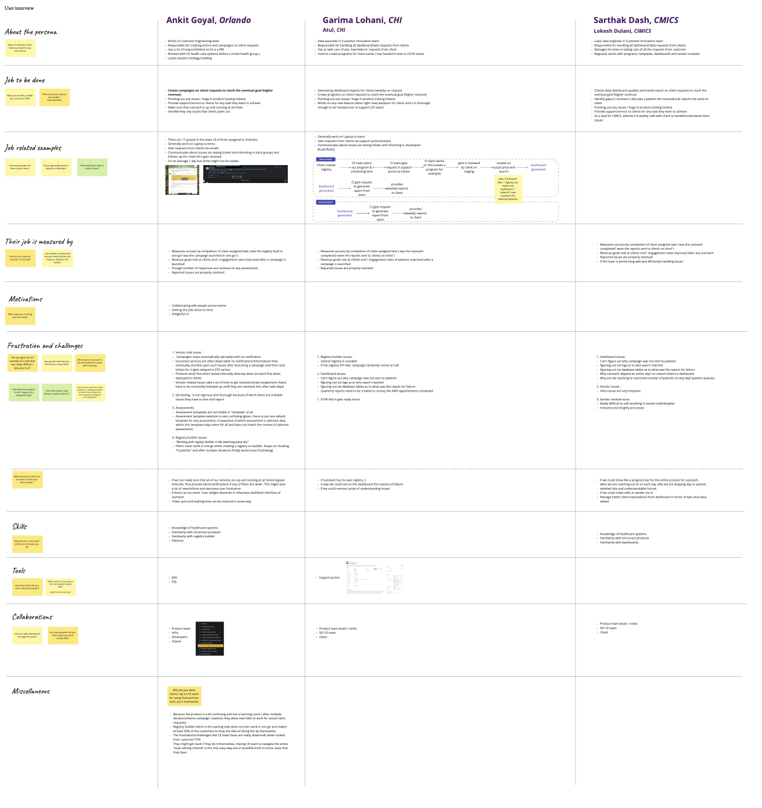
I started by refreshing the idea of the user we thought we were designing for. The sessions ran across 2 days of interviews with 6 users, covering Marketing / Clinical Managers, Marketing / Clinical Team Members and Customer Success Team Members.
- 02What is their journey?
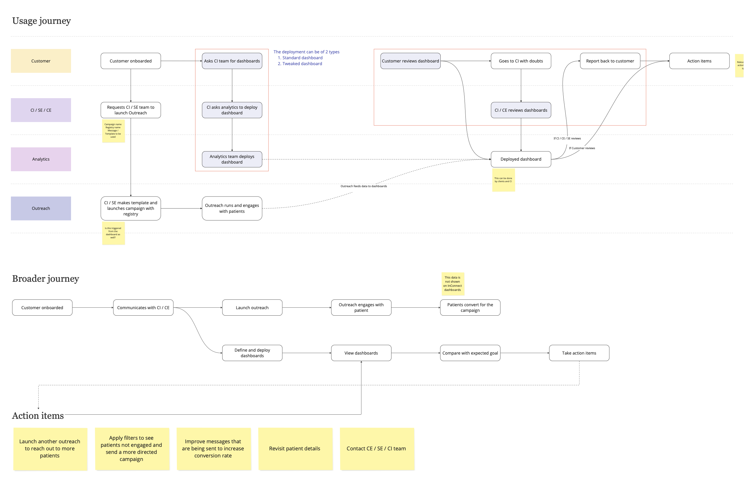
Next, I mapped out the complete user journey, marking how the different personas interact with each other, and how each deployment works.
- 03What do they need?
We referred to the new personas and the user journey to draw Dashboard Stories for each persona, mapping the need to view the dashboard, where they draw their insights from, and what the action items are.
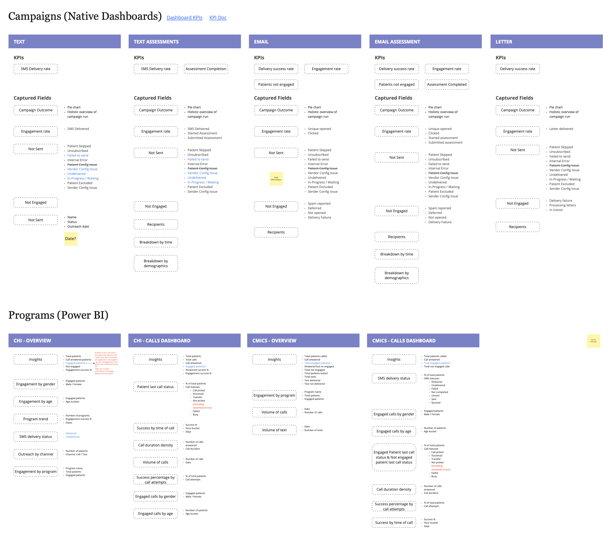
Research ran from an audit of every dashboard already in place, through the interviews, to the jobs and the stories they shook loose.
01 / 05 · Dashboard audit — Every dashboard in place at the time, broken down to the KPIs and fields each one captured.
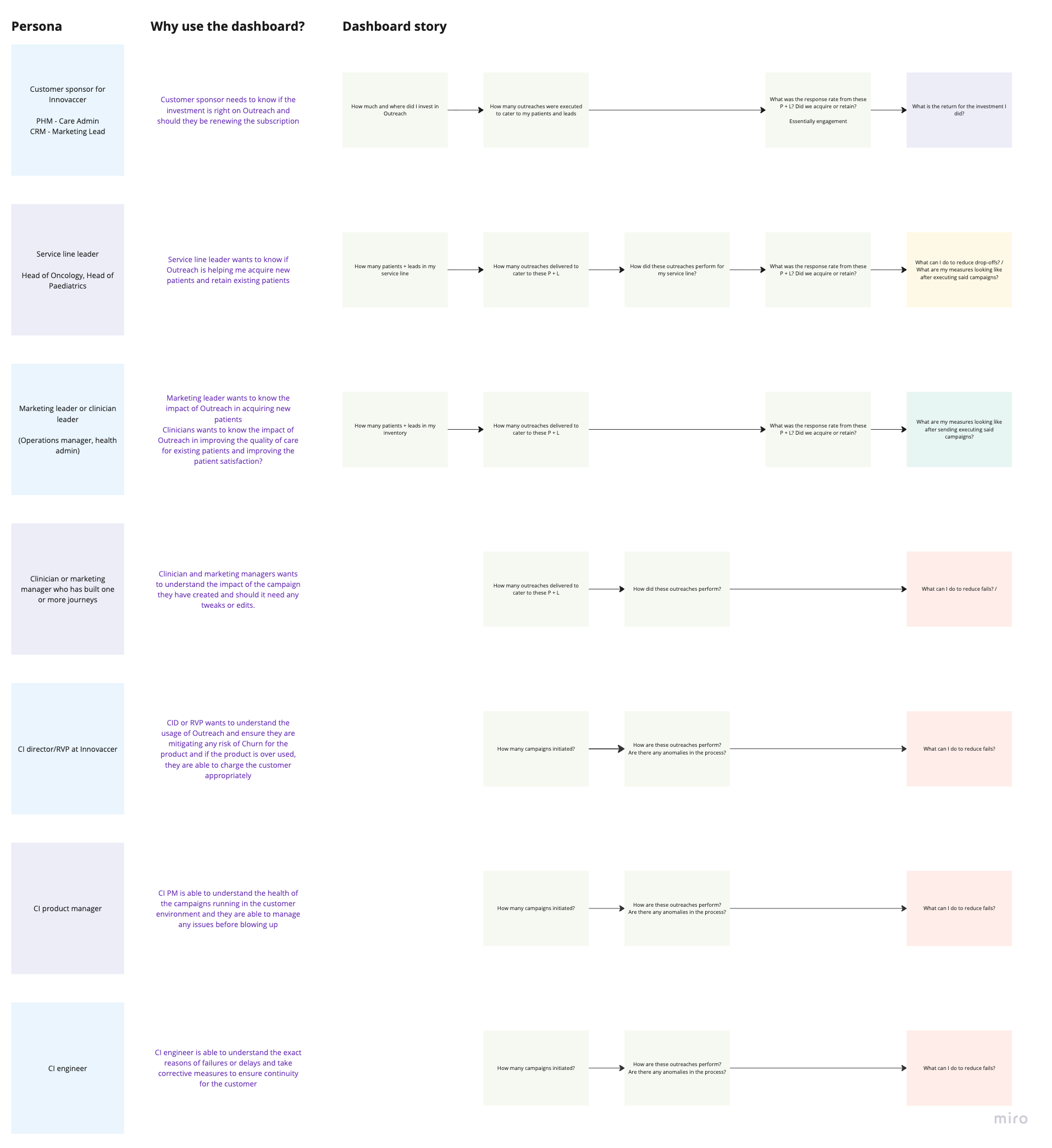
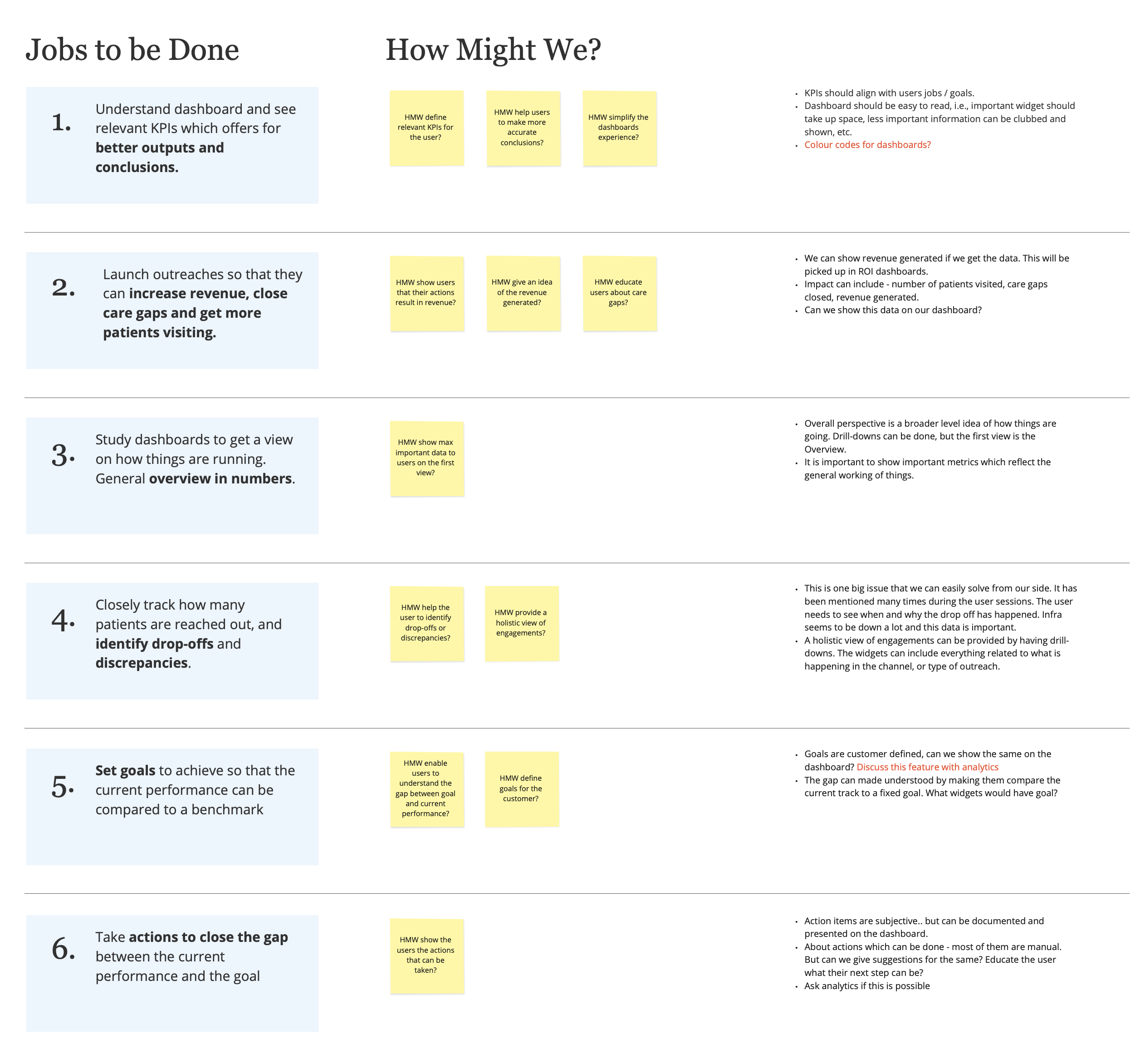
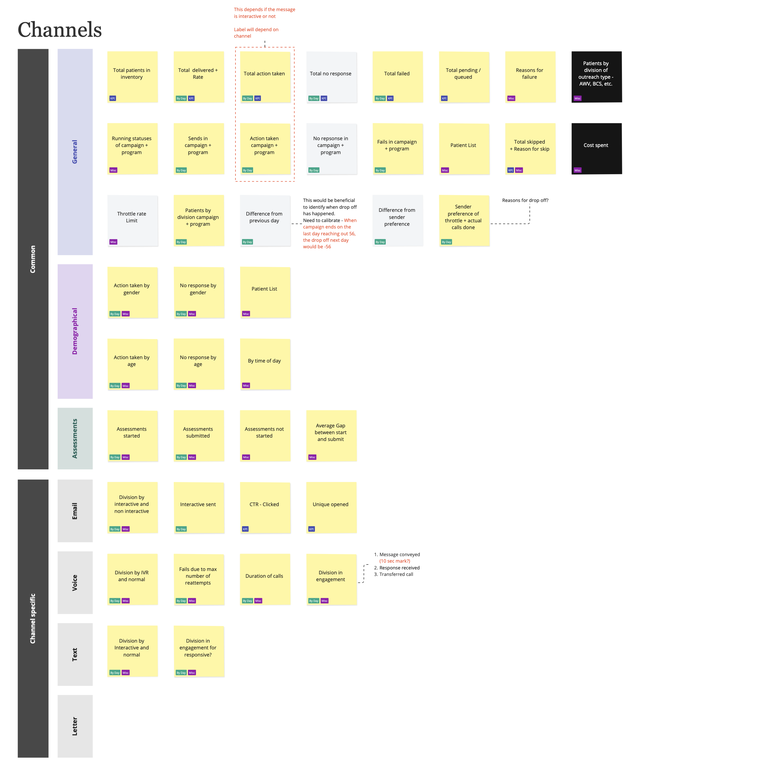
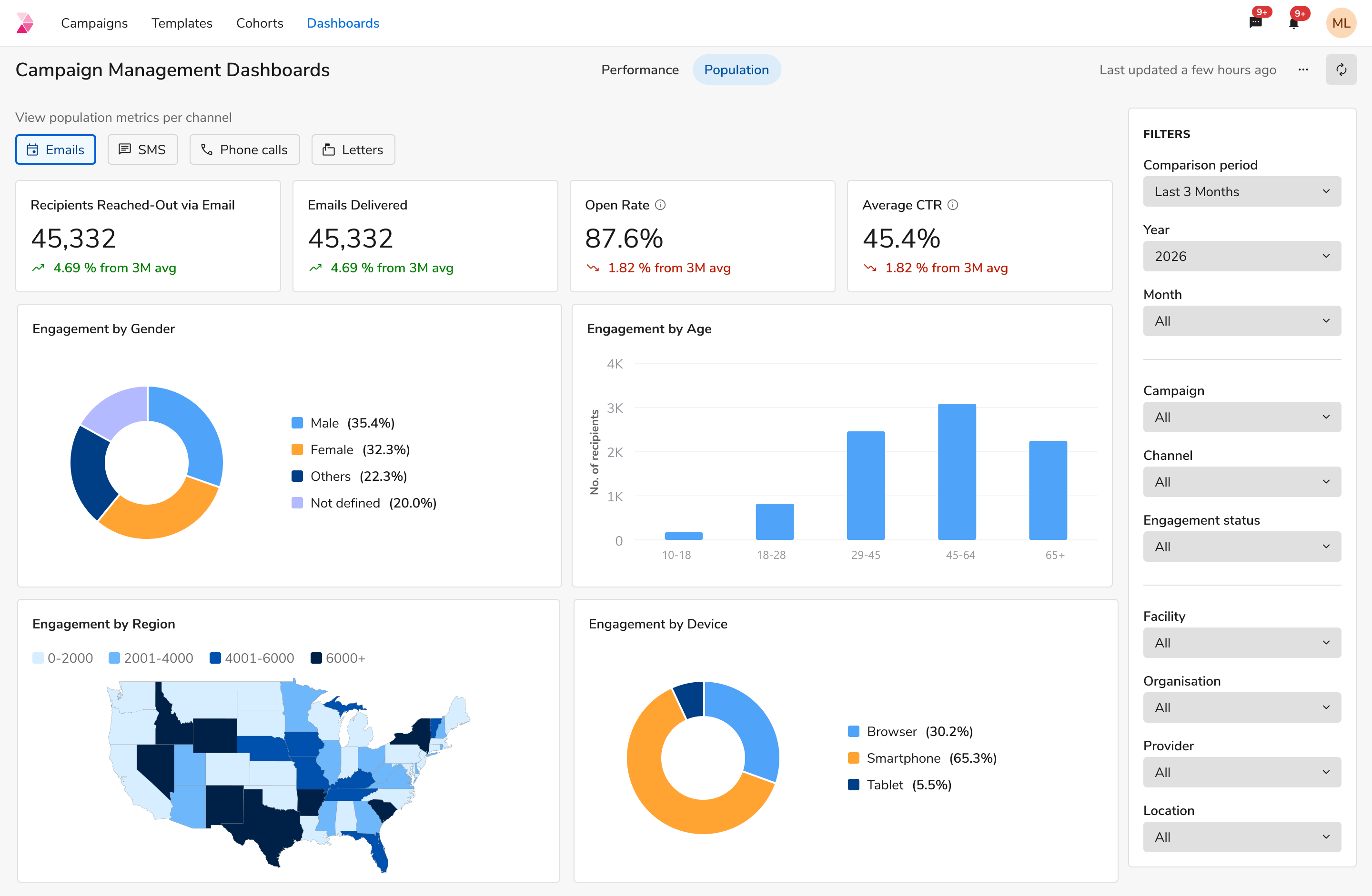
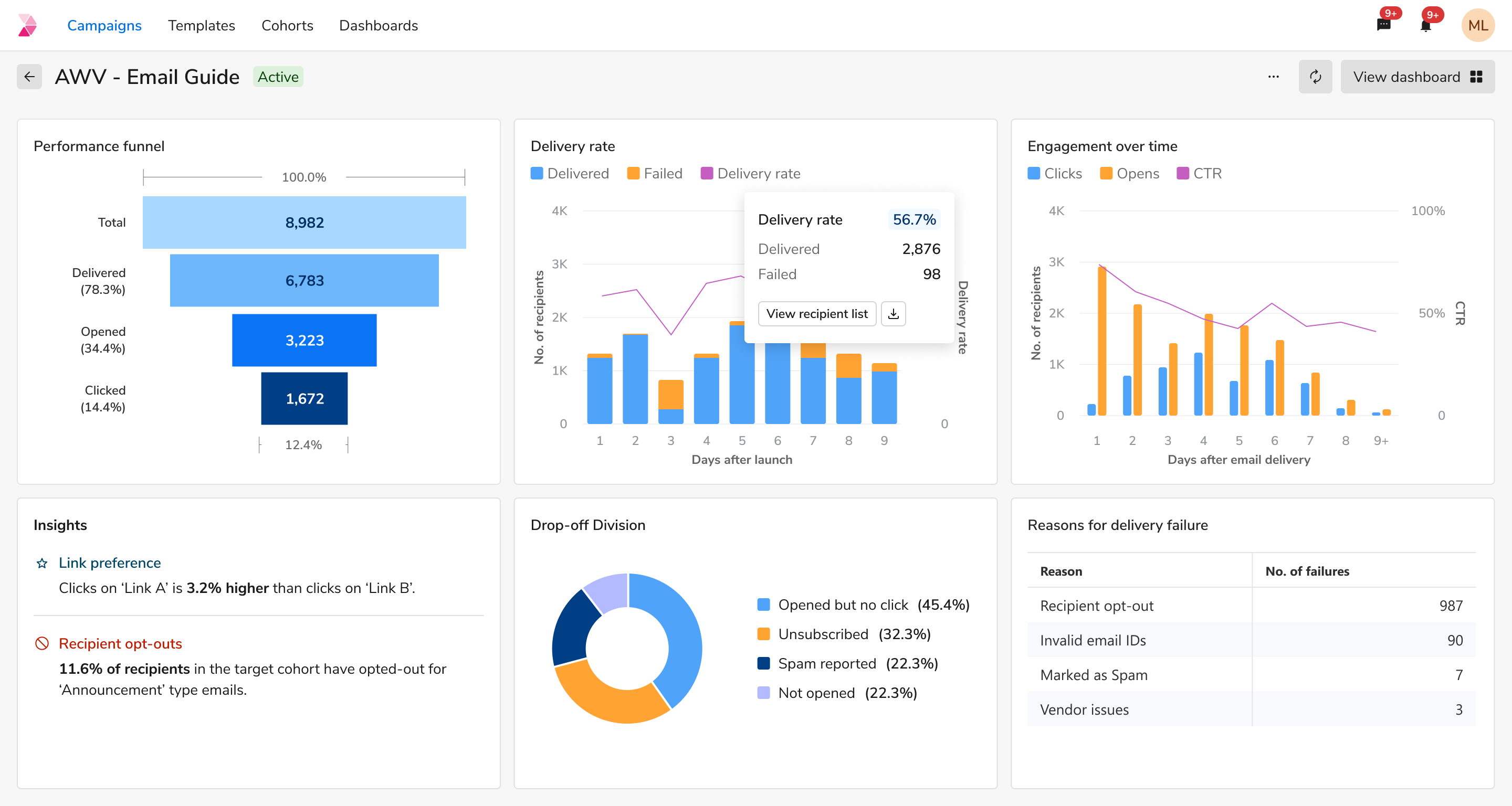
Working from the Dashboard Stories, I brainstormed the KPIs and metrics that answer the user's questions, and broadly classified them into 3 buckets. No visuals were decided yet: the KPIs were reviewed, trimmed and then re-iterated.
- 01
Performance
Conveys the usage and error rates of the product.
Delivery failure reasons · Delivery health · Goals & outcomes · New patients
- 02
Engagement
Conveys how the patient population engaged with the campaigns.
Click-through rates · Call pick rates · Total clicks on a link
- 03
Demographical
Conveys the reach of campaigns through the population.
Total recipients · Age groups · Genders
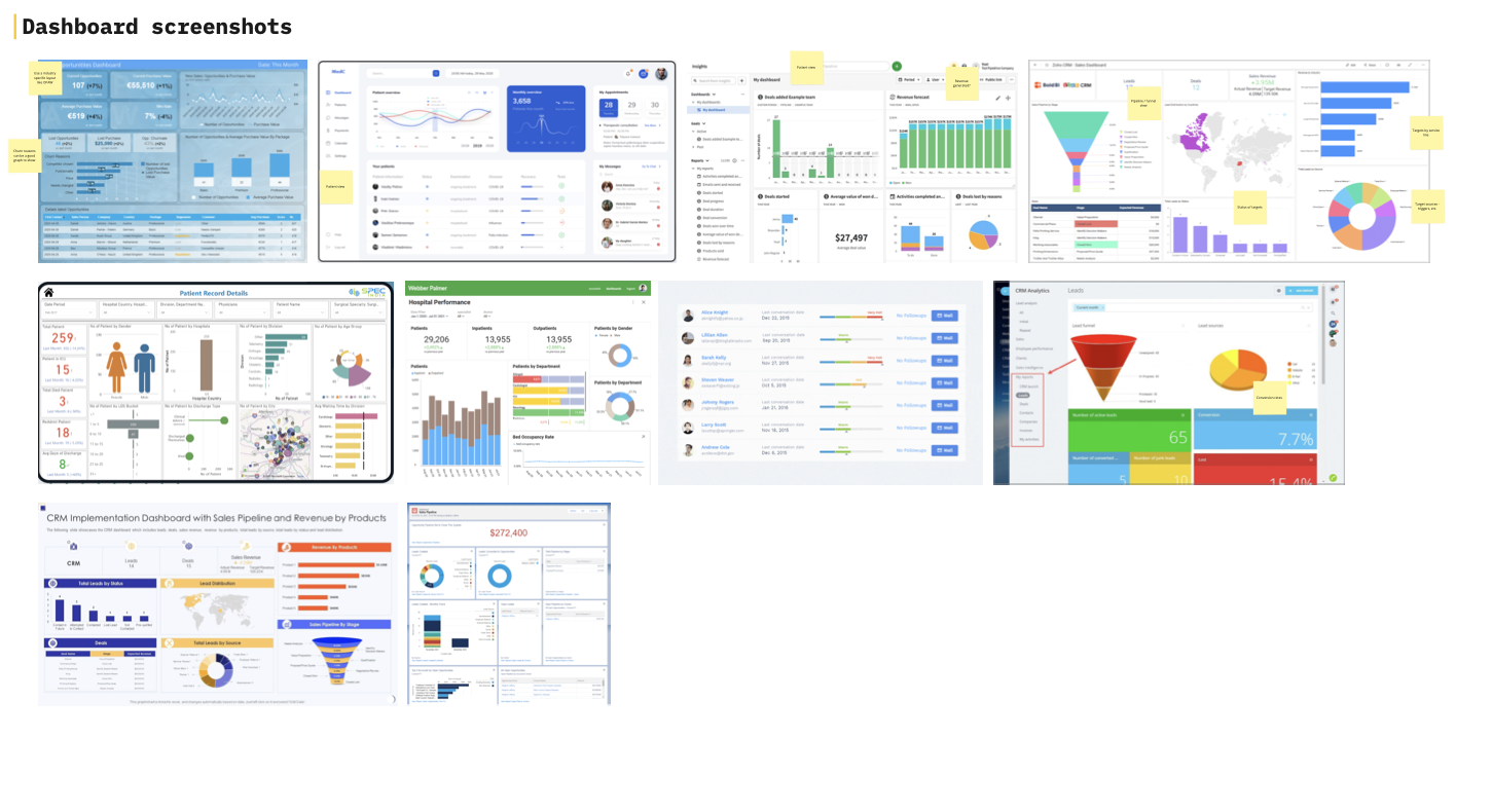
Now it was time to give some structure to the research. I explored visuals, looked at dashboards solving similar use-cases, and at what features PowerBI offered, which was one of the constraints we had to design within.
01 / 03 · Metric inventory — Every candidate KPI laid out and split into what is common to all channels and what belongs to one, tagged by whether it is a KPI, a by-day trend or supporting detail.
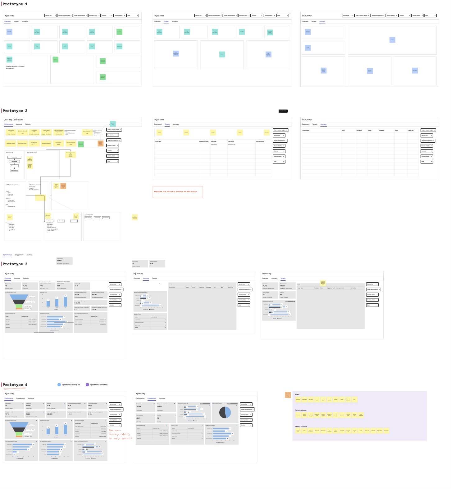
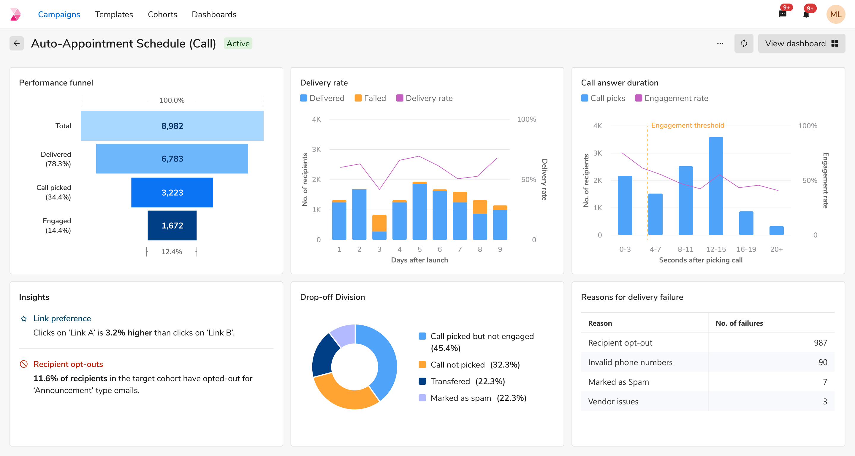
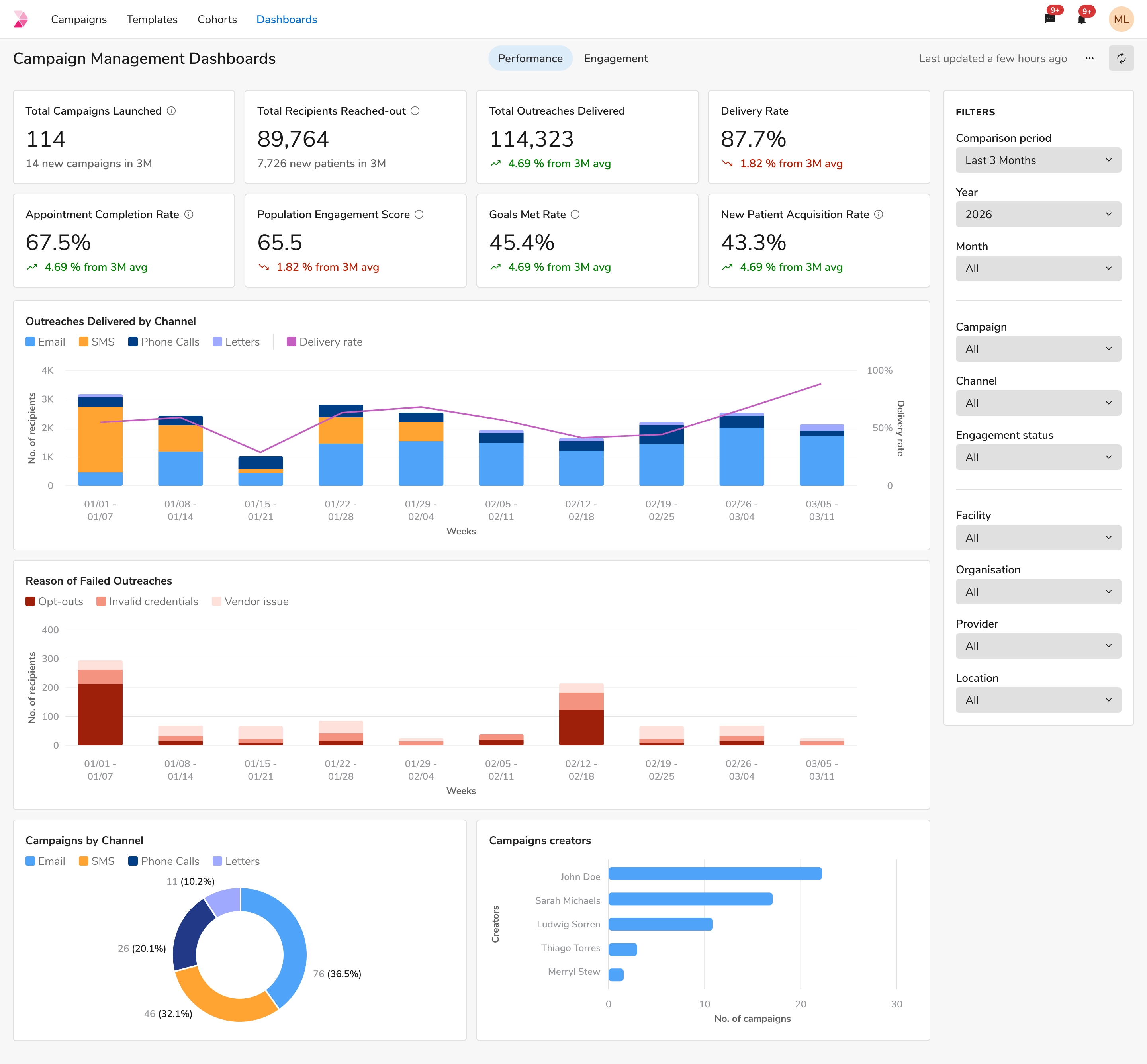
The dashboards landed in two layers: a campaign-level view for the campaign in front of you, and unified dashboards reading across every campaign in the program, with the same metric buckets running through both.
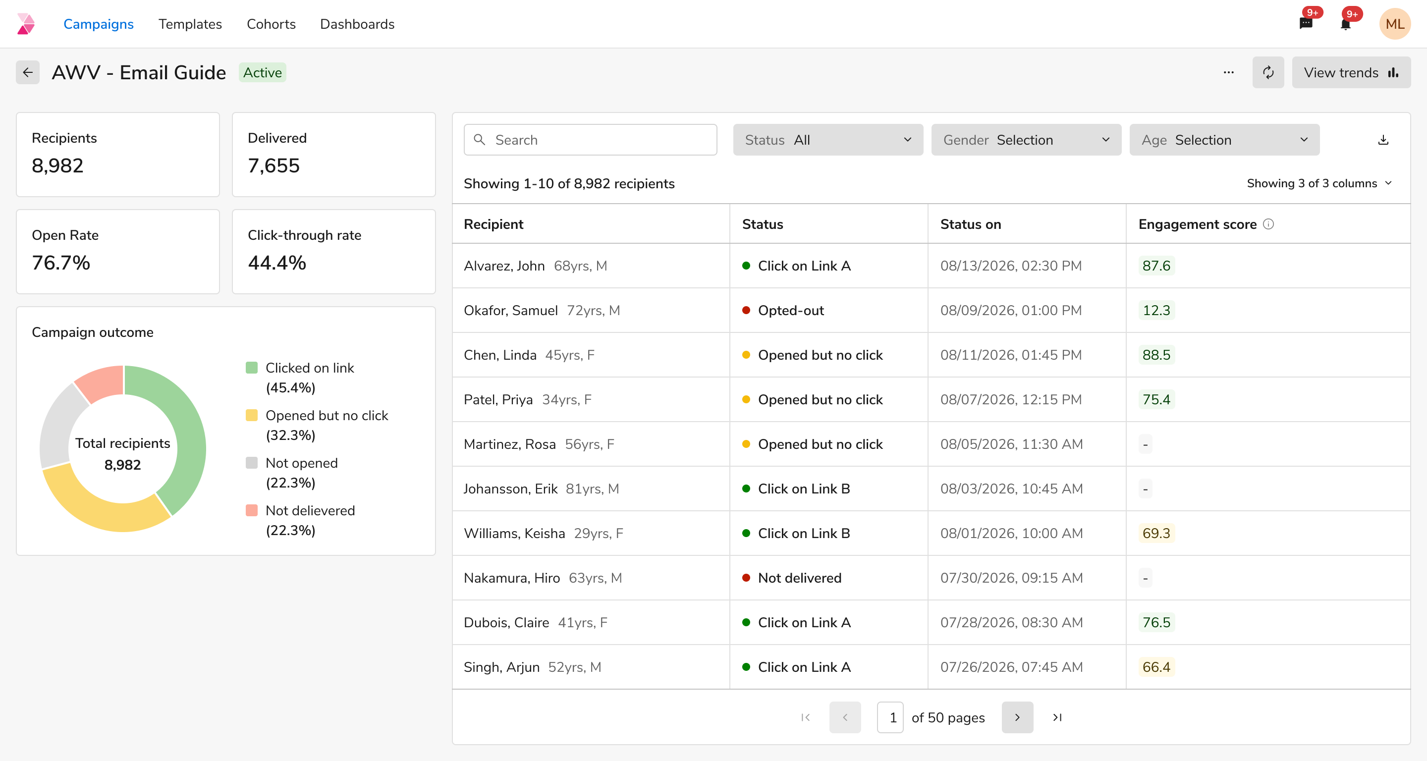
01 / 05 · Campaign view — The campaign after a user launches one. The most important KPIs sit upfront, beside a list of the recipients who were in the cohort.
The Mixpanel dashboards we tracked on were discontinued long ago, and with changing PMs, a solid tracker was never defined. However, here are some other patterns I observed.
- 015 more deployments, 2 tweaks
We deployed to 5 more customers after the dashboard work, and only 2 of them tweaked what they got: one to see engagement by demographics on the campaign-level dashboards, the other to add a few more engagement statuses to emails and voice calls.
- 02It held up in the room
Usability testing rendered good results, and it worked like a charm on demo calls. We had solved the transparency issues around drop-offs, while also letting users download a patient list for any filter and launch targeted campaigns off it, which were some of the key points raised in the user interviews.
- 03Untouched since handoff
The dashboards have not needed a change in the three years since handoff.